Portfolio | Case Study
Alibaba.com Header 2.0
From inconsistent navigation w/ over 26 different header styles to just 1 header. Detailed design system for B2B e-commerce website navigation.
When you have over 1.5 million¹ unique visitors on a site, it is imperative to provide a consistent, coherent, and meaningful navigation experience throughout the website for the best user experience. But not every page in an e-commerce platform is built the same and not every page has the same goals. And then there are business needs that are prioritized during a certain period of the year — e.g. promotional events, that lead to prioritizing marketing promotions over users’ pre-intent tasks. Over the past 19 years of its existence, all these have led to 26 different header styles on Alibaba.com. 🤯. Further, multi-language wasn’t a priority back then, so the old header UI misbehaved when translated to languages other than English.

Hence, we were tasked to provide a better IA and simple & consistent navigation experience to users throughout the website so they know where they are and can retrace their paths as they continue browsing, whilst meeting the various business needs for all Alibaba.com marketplaces, services, promotions, and landing page scenarios. And, here’s the solution — one header to rule them all. (I am going to be wrong in assuming this, but more on that later.)


Results ¹
Overall, 3% increase in click rate for each Link in the header. 👍
Overall, 2.5% average increase in organic traffic to subsequent pages. 👍
0.5% drop in click rate for User profile. 👎
Behind the scenes
My Role
I led the design of the New Header experience between January and April 2019 and collaborated with two Engineers and two Product Manager (and multiple other business stakeholders). To me, collaboration is the key to the best creative problem-solving experience possible.
Also, I performed user research, drafted prototypes, conducted user testing, delivered visual assets, and saw the project through its development. The page went live on February 22nd, 2019.
Next, I’ll only discuss the Header redesign process for the top 3 scenarios — Homepage, Search, and Details. (Marketplaces, Services, and Landing Pages will be covered in another case study.)
1. Vision + Goals
Our high-level goals were:
- Consistent navigation throughout the website. Measurement: Can we one unified header solution to cover all the website pages (or with minimal changes).
- Get more traffic to webpages from the Header. Measurement: Increased click UV for links.
- Make it easy for the user to understand the navigation. Measurement: Better information architecture based on qualitative user data.
- Cater to all business needs. Measurement: All business stakeholders should be satisfied with the results (internal survey).
2. Problems
01/ Inconsistency
As discussed earlier, the primary issue was the inconsistency in the Header. The header changed while navigating between pages and finding the same navigation element across pages was near to impossible. Refer to the image: 26 different header styles on Alibaba.com.
02/ Link Sprinkling — Poor IA
The old header included repeated links to the same function — a classic case of link sprinkling, hoping that one of the links will attract the user. This created confusion for the users (reported by 8/10 users from our User Research Study) as they would always “hope” to find the desired link in one of the navigation items by hit & trial. This was because of a lack of proper logical information structure in the Header.
03/ Multi-Language + Responsive
The old header didn’t take into account all the multi-languages scenarios that might affect the responsive designs. Due to this, Links started to overlap and information wasn’t recognizable.

04/ No visibility for Promotion/Deals
Alibaba.com hosts temporary ‘Promotions/Deals’ a.k.a ‘Activities’ that lasts for a week to a month depending on the type of activity. However, the visibility of these activities is only on the Homepage banners. Once the user navigates away from the homepage, there would be no means to access the promotions.
Also, not all users are organic traffic that would land on the homepage. Like every other e-commerce platform, Alibaba.com has a plethora of landing pages. Collectively, these pages get a significant amount of traffic that never gets to know the ongoing Activities on Alibaba.com — a missed opportunity.
The Promotion business team wanted us to figure out a solution to increase the traffic to their pages.
3. Solution
01/ Background Research
We performed a competitor analysis of 24 different website headers.

We wanted to learn what were the common links (link groups) being used, the placement of these links, and the copy being used by our primary competitors. We also closely analyzed the multi-language and responsive behavior of these websites.

Next, we analyzed the Alibaba.com header click UV data. (I cannot disclose real the data ¹*, but, here’s an approximation of the click engagement for the various items on the old header.)

Keeping aside the Alibaba.com logo click data, it was evident that the engagement was the highest for the profile/account management which included various entrances and notification. Contrary to our beliefs, the Orders and Favorites entrances had a low engagement.
02/ Improving the Header IA
We first conducted an open card sorting to help us evaluate the information architecture of the site and understand our users’ expectations. 11 participants organized and labeled topics into categories that would make sense to them. We used sticky notes for the card sorting.
Based on users’ grouping, and a few rounds of internal team discussion, we summarised the categories as follows.

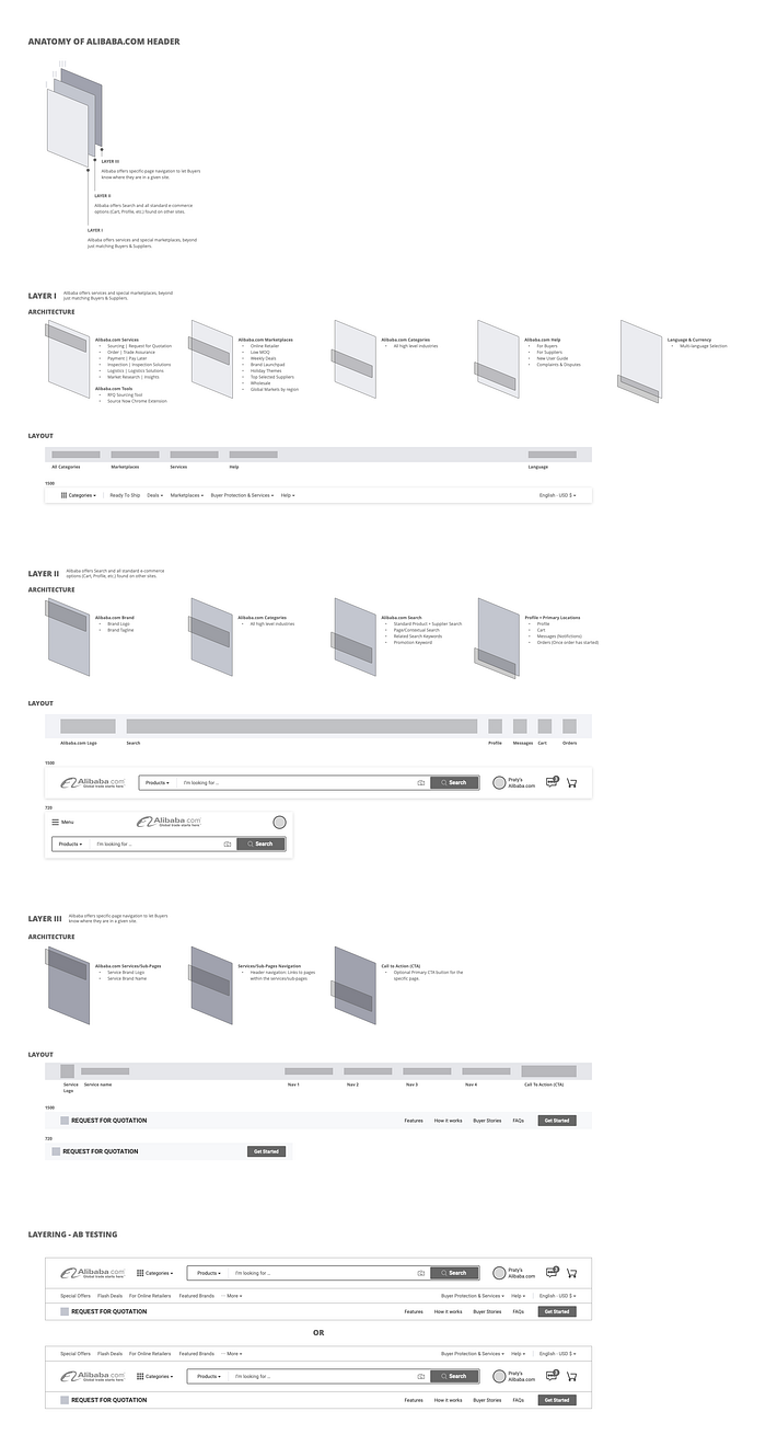
Lastly, based on the above card sorting findings and the competitive analysis, we divided the header into 3 layers, viz.
i. Basic e-commerce — Logo, Search, Profile/Account Management

ii. Markets & Services — Marketplaces, Services, Help, Language Switch, App download

iii. (Optional) Page navigation — site pages would have their navigation

Layering all the 3 sections:

Below is the IA breakdown of the Header and how we arrived at the conclusion.
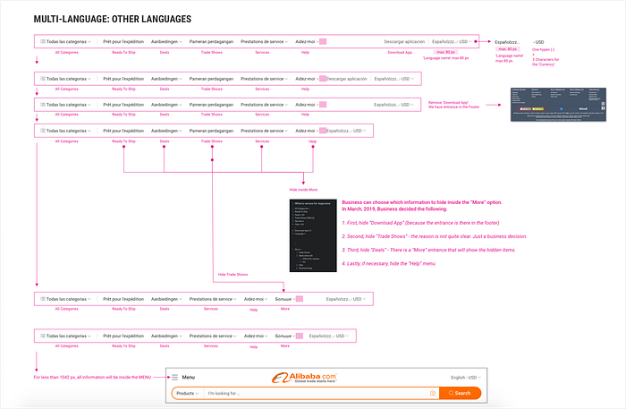
03/ Handling Multi-language. Gracefully.
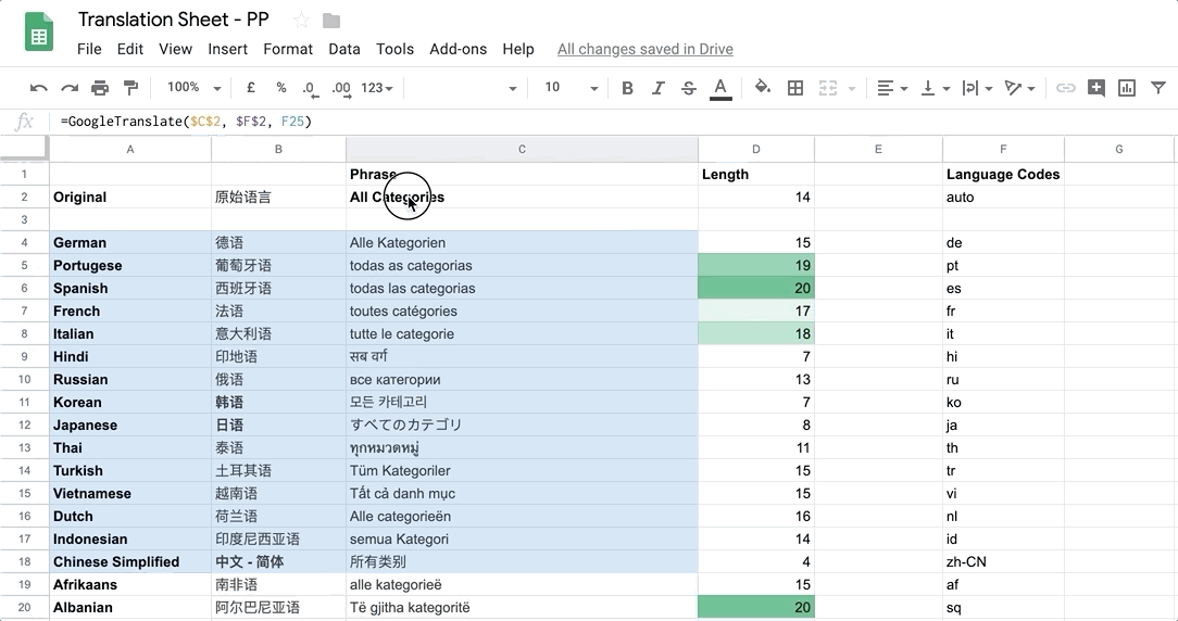
Alibaba.com website supports 16 languages. Designing a header (or any other page) while taking into account all 16 languages has its own set of challenges.
I used my simple Translation Sheet to calculate the max (and average) multi-language word length for the Links. e.g. ‘Help’ text (4 characters) would need more space when translated to French, (Aidez-Moi).
04/ Designs
During the design phase, we came up with various versions for the Header.
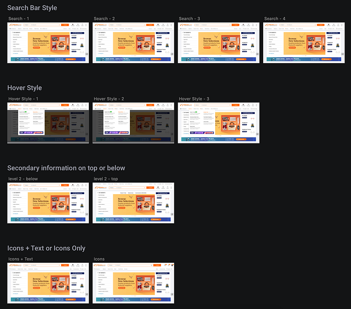
After several rounds of design critique (My Design Critique Template) and feedback from key stakeholders, we decided 2 Header styles for A/B test.

We also accounted for multi-language and proper responsive breakpoints.

The new header is now live on Alibaba.com. Feel free to try it out. (Not all suggested designs were implemented due to limited engineering resources.)
4. Results ¹
The AB test results helped us decide the final Header version. From a design point of view, we (most designers) preferred Version B over Version A, however, the various links click data was better for Version A.
We also split the traffic, 33.33% (New Header) & 66.67% (Old Header) to measure the click data. The New Header outperformed the old header in overall click data.
Final Data:
Overall, 3% increase in click rate for each Link in the header. 👍
Overall, 2.5% average increase in organic traffic to subsequent pages. 👍
0.5% drop in click rate for User profile. 👎
The click rate for the User Profile decreased by 0.5%. (More data analysis needs to be done to uncover the reasons behind this decrease.)
5. Next?
In the coming months, we’ll be extending this new header to cover Marketplaces, Services, Landing Pages, and Forms on Alibaba.com. There will be some changes to the New Header layout to account for its respective page’s goal.
(We are in the middle of an AB test with just 1% of the traffic to test what would happen if we use this new extended header on some of our Search SEO Landing pages. We hypothesize that it would increase the bounce rate of that page. Only time will tell. 🤞)
Stay tuned for the next case study…
Just for gigs, we also tried a dark version of the header. …. 🤢

¹ The data do not represent real values. These are proportional to the real data and have been created for sharing outside of alibaba.com.)
Design NDA Disclaimer
*To comply with my non-disclosure agreement, I have omitted and obfuscated confidential information. All information presented is my own and does not necessarily reflect the views of the company.*
Thanks for reading. And, before you go…
Clap 👏 , if you enjoyed it, so others can find it
Comment 💬, if you have a question you’d like to ask or know more about
Follow me (Praty) to know the inside stories from Alibaba.com Design and more…
More interesting reads…
We designed and developed an optimized payment flow that shows our free sellers the real benefits of being a paid seller on Alibaba.com. 👇
You can help your teammates make sense of Cross-cultural design for websites/apps. Here’s an extensive slide deck just for you — Clearly Cultural. 👇
Or, conduct an Accessible Design workshop to talk about inclusive designs. Here’s how I did it 👉 https://www.linkedin.com/pulse/conducting-accessible-design-workshop-pratyush-pandab/
Thanks for reading! Get in touch →